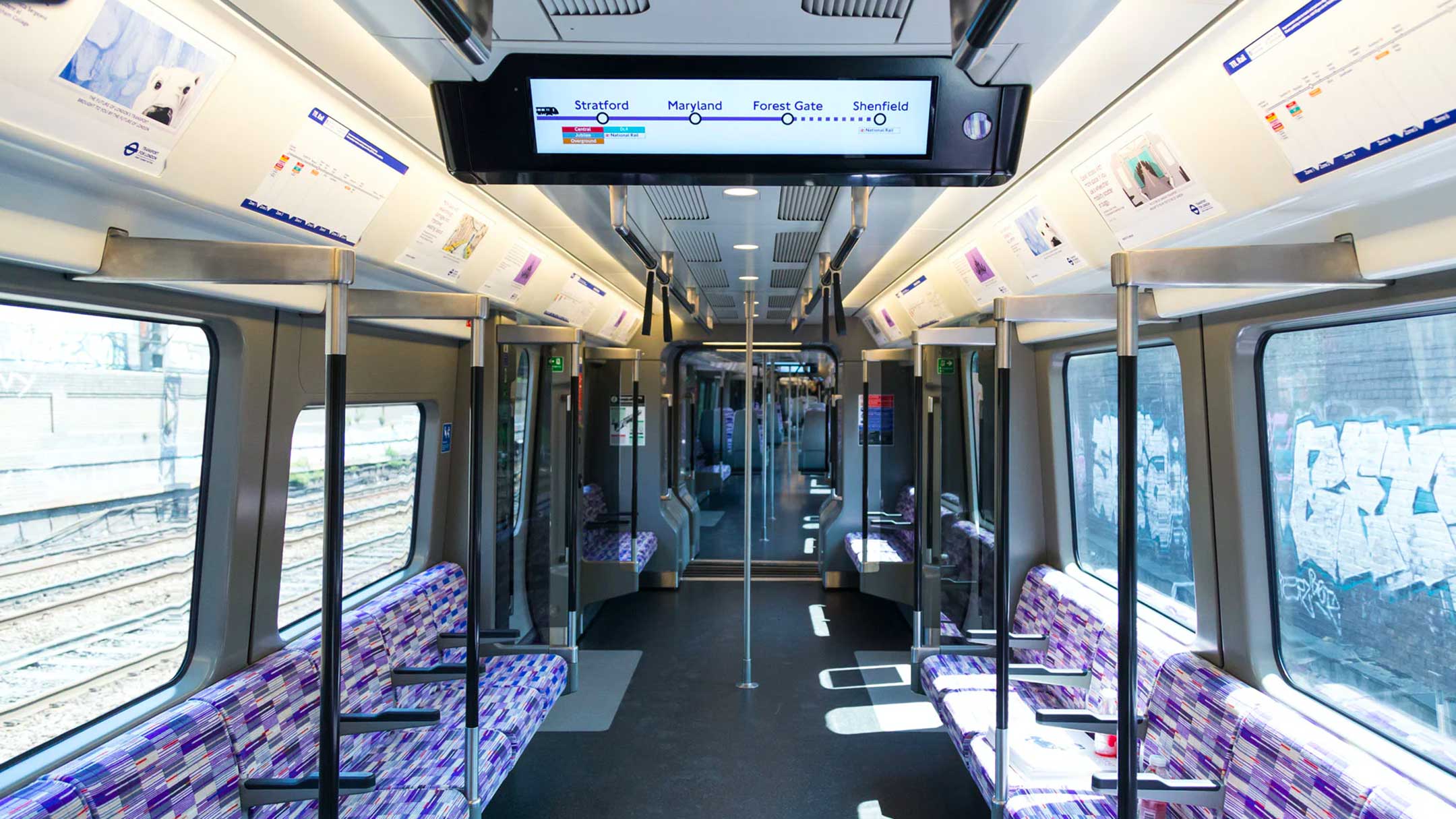
Inside the epic design challenge of the Elizabeth line

Over 30 years in the making, the new Elizabeth line in London is a herculean feat of engineering, architecture and, of course, design. We speak to TfL’s head of design, Jon Hunter, about how it will change the face of transport in London and beyond
More than three decades and almost £19 billion have come and gone since the Elizabeth line, in its current form, was proposed in the 1989 Central London Rail Study. Launching from this month, the end result is one of the most complex digital railways in the world, stretching 100km between Shenfield in Essex and Reading in Berkshire at its two furthest points. When it is fully operational next year, it will add around 10% extra capacity to central London’s rail network, putting an additional 1.5 million people within 45 minutes of the heart of the capital.
Beyond the railway’s feat as a “megalopolis of engineering”, as the Guardian describes it, the project has also been a huge architectural and design undertaking. Thankfully, Transport for London’s rich design heritage has stood it in good stead. Several of the organisation’s most recognisable assets are legendary pieces of 20th century design history – from Harry Beck’s Tube map, to Edward Johnston’s Johnston Sans typeface, to the iconic TfL roundel, which remains largely unchanged since its introduction in 1908.
Heading up TfL’s 50-strong design team today is Jon Hunter, who has worked at the organisation for the last 15 years. “As you can imagine, we have a complex definition of the word design at TfL,” he tells CR. “Basically everything that customers are going to interact with has come through my team. I used to say ‘From tea cups to trains’, but we do more than that now. Trying to have that one-mind thinking across a lot of areas is probably my biggest role.”
